My aim in working with climate data is working out how to combine it with financial data to answer the question “how much will climate change actually cost?”. This is becoming a very heavily subscribed area of research, helped by organisations such as Copernicus and the World Resources Institute (WRI) publishing climate data with open access licences and many companies, both new and more traditional, attempting to quantify the costs of the changing weather.
Published climate data results from various degrees of processing, with the most fundamental variable being temperature change. Precipitation (rain and snow), drought and wind models add further data and physical assumptions. The complexity of the analysis increases even further if we want to predict events such as floods and droughts. Because climate models become more uncertain the more information is added, we would like to predict financial outcomes based on the most fundamental variables – ideally temperature – so I have been looking for a financial impact to predict based on primary climate models and openly available financial information.
Electricity price data for Europe is openly available from Nord Pool and as most electricity in Norway is hydroelectric, Norway is a cold country, and there is no domestic gas supply, temperature might be used a proxy for electricity demand, and rainfall as a proxy for supply. Therefore the following hypothesis seems quite testable:
Hypothesis – Norwegian Electricity Price Can be Predicted from Weather Data
My aim is to predict prices without knowing much more than the above about electricity trading, or how decisions are made. This first article will be about acquiring the data and getting it into shape for analysis.
Electricity Data
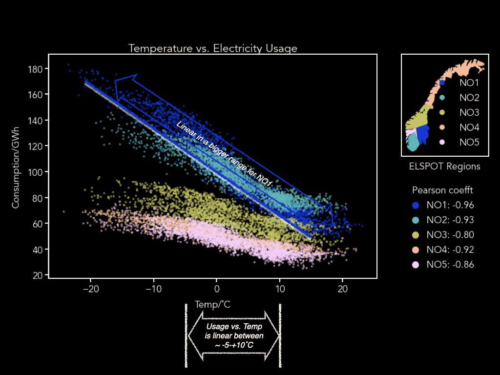
As mentioned above, the electricity data is available from Nord Pool. There was daily data from 2013 onwards, for the five Norwegian electricity trading regions, as well as most of North-Western Europe. Below is a summary of the mean annual consumption and production in the 5 regions within Norway. We can see the two south-western regions – NO2 and NO5 – produce the most electricity (as we will see later they are also the wettest) and the two most populous, southern, regions (NO1 and NO2) consume the most.
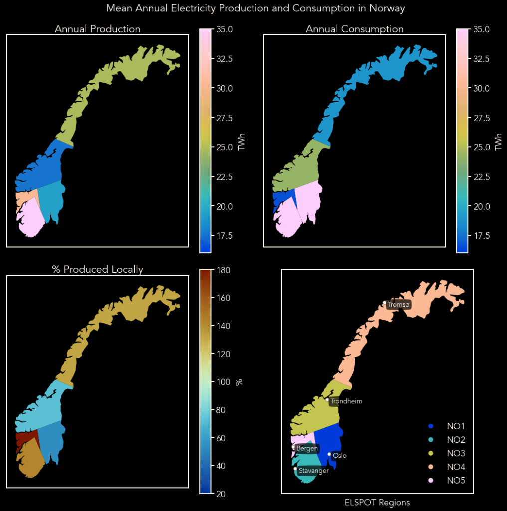
Since I want to start from basic weather information and financial data, I will not be using production and consumption directly in my analysis, but we will have a quick look at the end of this post whether temperature and precipitation are predictors of consumption and production, to decide if my hypothesis may have legs.
Electricity Price Over Time
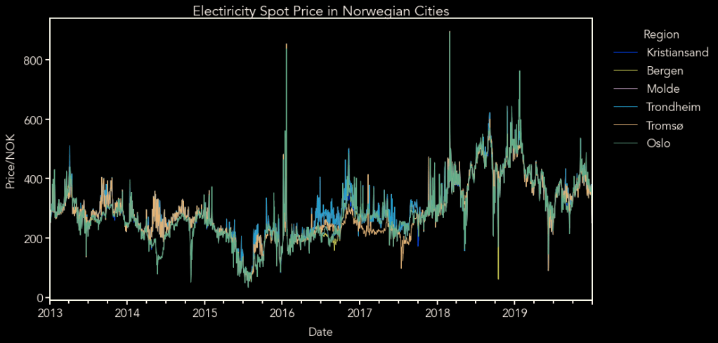
Below is a plot of raw electricity prices for each area, and you can see they are mainly the same from one area to the next, so for simplicity I will just use Oslo prices. I suspect deviations in price are due to there being very little transmission capacity between northern and southern Norway, which can cause different supply and demand pressure between the areas during years with unusual weather.
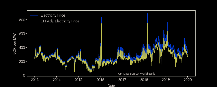
Below is a plot of the raw electricity prices fo Oslo, and those adjusted using the consumer price index, referenced to 2011. As we can see there are some fairly large variations: excluding the large spikes, prices vary between 100 and 600 NOK per MWh. From the lower plot, we can also see that there is no obvious price trend over the years – 2015 is the cheapest year, while 2018 is the most expensive, and looks anomalous – but electricity does tend to be cheaper in the summer months, compared to the winter.

Climate Data
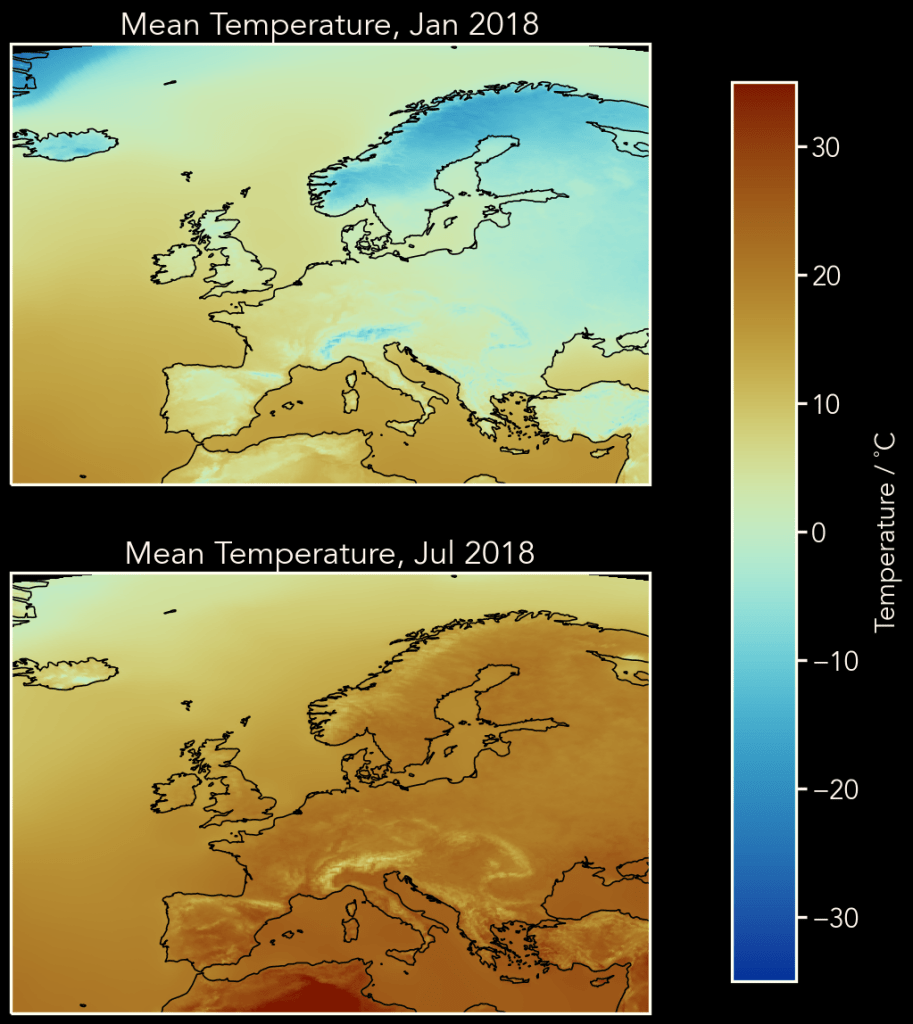
This is where we get to the interesting part: the climate data. The Copernicus Climate Data Store (CDS) is the data repository for the European Union’s Earth observation program and offers climate datasets from raw observations, to past and future models. For the first part of this analysis I will use reanalysis data, which is a dataset made from past weather observations, harmonised over a given area, in this case, Europe. If I create a promising model, I can then apply this to future projections of the same variables.
The datasets I used can be found here, and I downloaded data for the years 2012-2018, which corresponds to the years I have daily electricity data for, plus 2012. For the analysis I will use
- Temperature at 2 m above ground, which is on an 11 km grid
- Total precipitation, which is on a 5.5 km grid. This includes all precipitation – rain, snow and other forms of ice – and is given in kg/m2, which for rainfall is equivalent to mm. I will use “mm” here, since that what most are used to. However, bear in mind that, for snow, this is basically how much melt water there would be.

NETCDF files
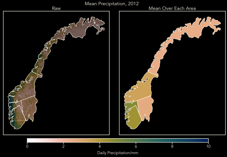
Climate data is available in NetCDF format, and the files can be rather unwieldy, with one year’s worth of data, for one variable, being 1.5-2 Gb, so the first task is to decimate the data to a more manageable size. I did this by selecting the data from each of the ELSPOT regions and taking the mean.
This turned out to be more complicated than expected because the polygons (i.e. shapes of the areas) available on Nord Pool were not actually geographic: they were just a set of Norway-shaped x,y coordinates that didn’t correspond to the surface of the Earth (in any way I could find, anyway). So I had to pick some myself, meaning they are approximate. You may note from the images below that even the outline of Norway (which I didn’t hand-pick!) is different. This is largely down to the difficulties of plotting the surface of the round Earth onto a flat rectangle; these two maps use different solutions. The large “peninsula” at -70y on the left is actually the Lofoten Islands, so not joined to the mainland and not included in the map on the right.

Using the picked polygons, I selected data within each area and took the mean, resulting in one data point per area per day, thus reducing the number of points by a factor of 60,000. Below are examples, showing the mean for 2012. We can see that there is quite a big variation within areas, with about half of Norway being, on average below freezing. And, yes, the average year-round temperature in Norway is around freezing! We can also see that the West coast receives about five times as much precipitation as the rest of Norway.
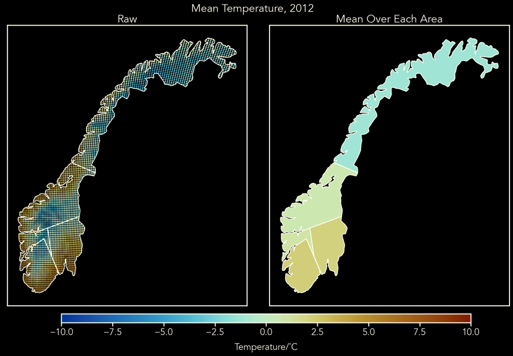
All of this means the Oslo area has possibly the best climate – not too wet and nice warm summers. But what does it mean for electricity prices?
Quick Look at the Combined Data
Temperature
Below is a quick plot of consumption vs. daily temperature. The plot includes Pearson coefficients, which I will go into in more detail in the next post. In brief, the Pearson coefficient is a measure of strong a linear relationship there is between two datasets: 0 means no relationship, +1 there is a perfect positive relationship (an increase in one variable gives and increase in the other) and -1 means a perfect negative relationship.
You can see straight away that a simple linear model could be made to to predict electricity consumption from temperature. In fact, in the Oslo (NO1) area it’s linear across the whole temperature range, implying most electricity is used for heating. In the other areas the data flattens out above about 10˚C, possibly because this is the temperature below which vacant properties are heated to stop them freezing. The data also flattens out below around -5˚C, an observation that I don’t have a hypothesis for!
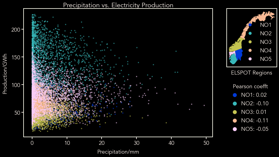
Precipitation
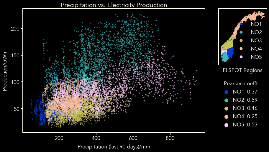
When it comes to precipitation, the picture is more complex. The first plot below shows how precipitation on the day affects production, and it’s not entirely unexpected to see that the answer is “not much”. We might expect that production is more affected by precipitation over a period of time i.e. how full the reservoirs are. The second plot shows how production is affected by precipitation over the past 90 days and we can see a clear pattern emerging.
You might ask “why 90 days?” and the answer is, it’s just a guess; it’s roughly a season. In the next post I will explore this number further and see if there is a better time period to use.
Conclusions and what next?
The purpose of this post was to lay out a basic hypothesis – that electricity price in Norway can be predicted from temperature and precipitation – and to present the input data and its sources.
So far the idea that electricity production can be predicted from precipitation, and consumption predicted temperature looks fairly solid. The next post will explore how this affects price using simple linear regression.
After that I could either progress to more advanced machine learning methods or apply the linear model to future data. That is still to be decided!
